This is what we do
FAQ


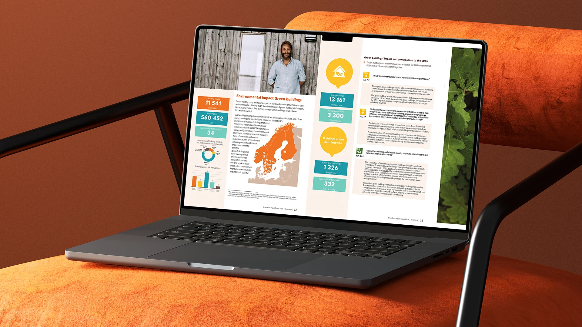
Bisnode needed new ways to visualize data in a clear and consistent way. The project included a workshop, development of Excel templates in the company's graphic profile, as well as training and instructional material. The result was improved data visualization and increased efficiency in daily work.
Automate your reportsLearn more about our Office templates
Bisnode (now part of Dun & Bradstreet) is a leading provider of business intelligence and analytics in Europe, helping customers make data-driven decisions through insights and forecasts based on comprehensive data sources. By offering relevant and up-to-date business data, Bisnode contributes to growth and risk minimization.
Finance and Professional Services
5000
Bisnode handles large amounts of data and needed new ways to visualize it in a clear, consistent and appealing way. The challenge was to find a solution that not only improved the communication of numbers and charts, but was also easy for all employees to use in their daily work.
It became clear that the existing ways of working did not fully support the needs. Bisnode needed both inspiration and practical tools to transform complex datasets into visual presentations that both convince and engage. Therefore, they asked for a complete package with a workshop, template production in Excel and training.
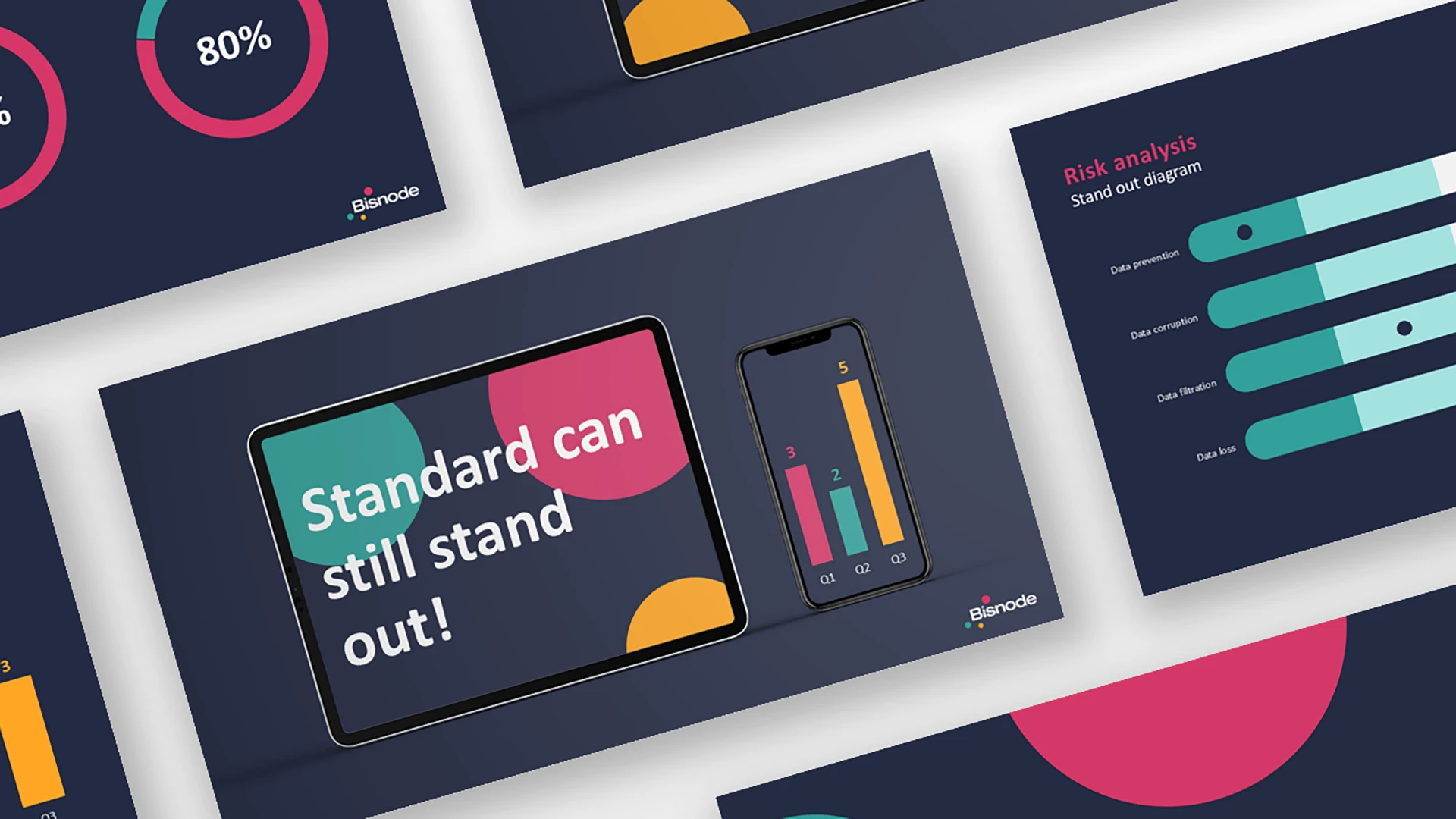
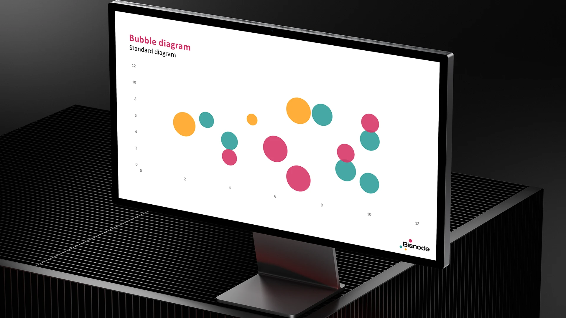
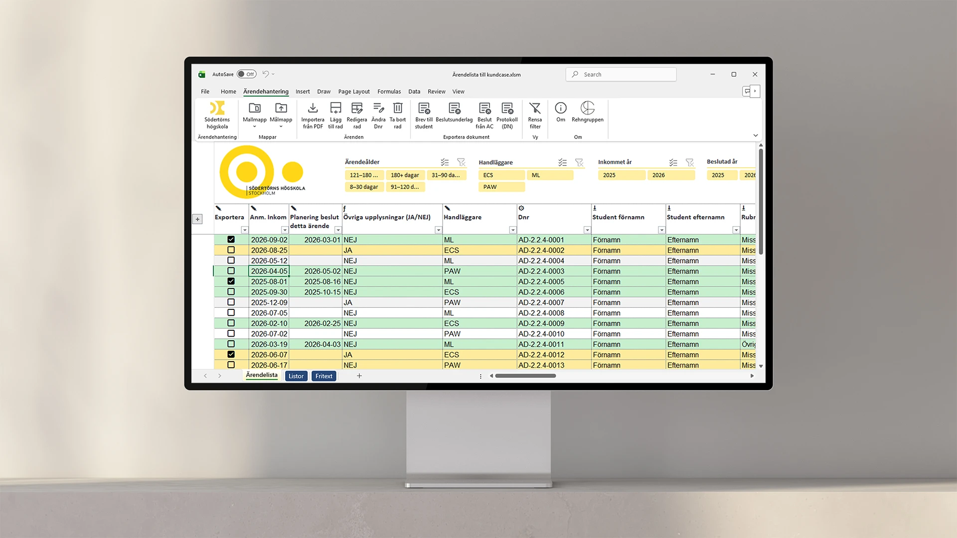
The project started with a creative workshop where Rehngruppen and Bisnode's team explored new ways to present their data. Next, we produced custom Excel templates with ready-made chart types - bars, circles and lines - designed in Bisnode's graphic profile with a consistent color theme. Finally, we produced instructional videos and held a training session that gave employees both the knowledge and support to use the tools properly.

.webp)
The result was improved data visualization and increased efficiency throughout the organization. Employees can now create consistent and professional charts directly in Excel, while having support in the form of training and instructional materials. Bisnode has a long-term tool that makes it easier to communicate numbers - and that turns data into visual stories that engage.
Fill out the form or call 08-120 233 30.