This is what we do
FAQ

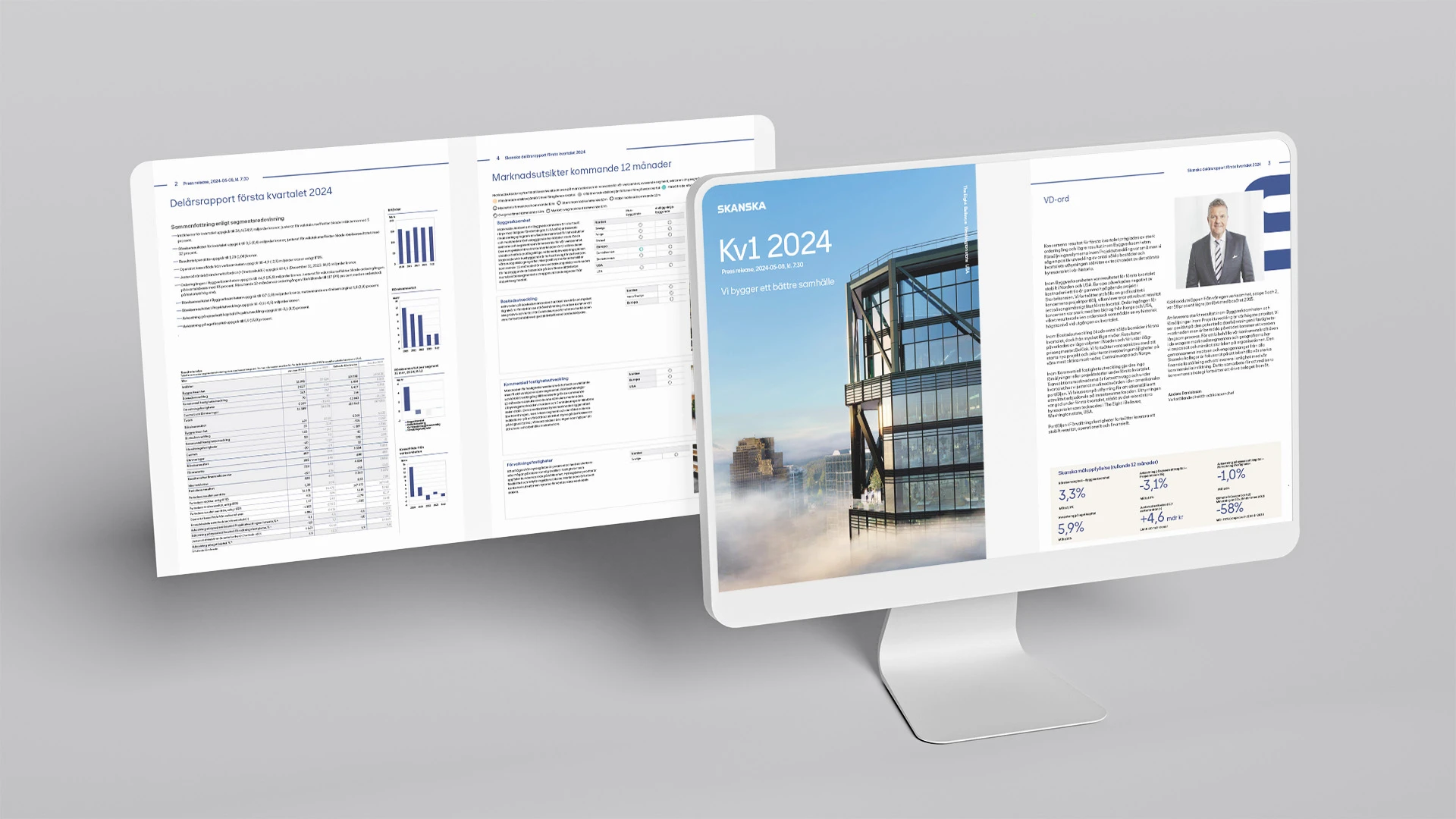
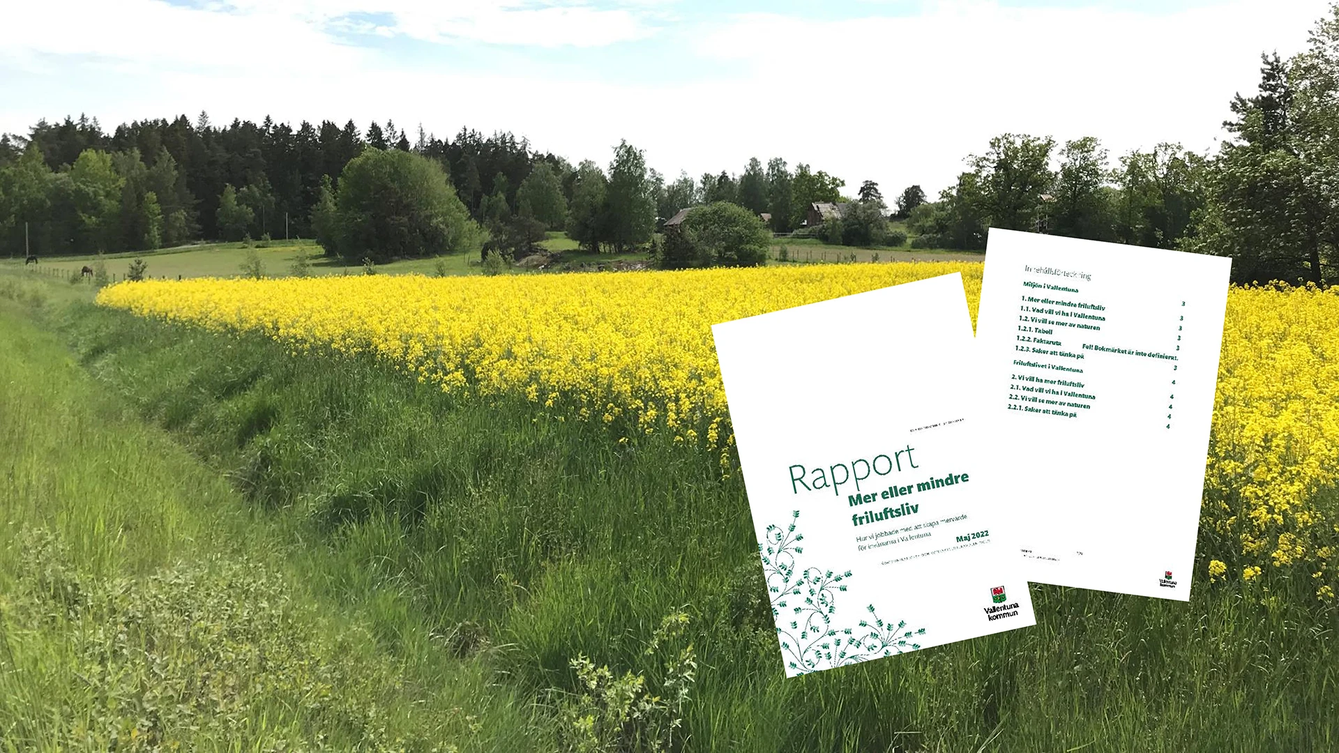
Vallentuna municipality was in need of new Word templates. The assignment involved creating easy-to-use templates that follow the municipality's graphic profile, for example in the use of colors and graphic objects, while ensuring that the templates are the basis for accessible documents.
Automate your reportsLearn more about our Office templates
Vallentuna municipality is a growing municipality in Stockholm County that combines proximity to the city with a rural character. The municipality is investing in developing infrastructure, housing and services, while protecting natural and cultural values to create an attractive living and business climate.
Public and Non-profit sector
5000
Vallentuna municipality was faced with the need for new Word templates. They had to be easy to use, follow the graphic profile and ensure that the documents produced were accessible according to the requirements of the Web Directive.
Meeting the requirements required both knowledge and accuracy. The templates needed to be adapted to work with screen readers, correct reading orders and color contrasts. At the same time, the municipality used a special font, which required quality assurance of licenses, functionality and how the font worked in different programs and PDF exports.
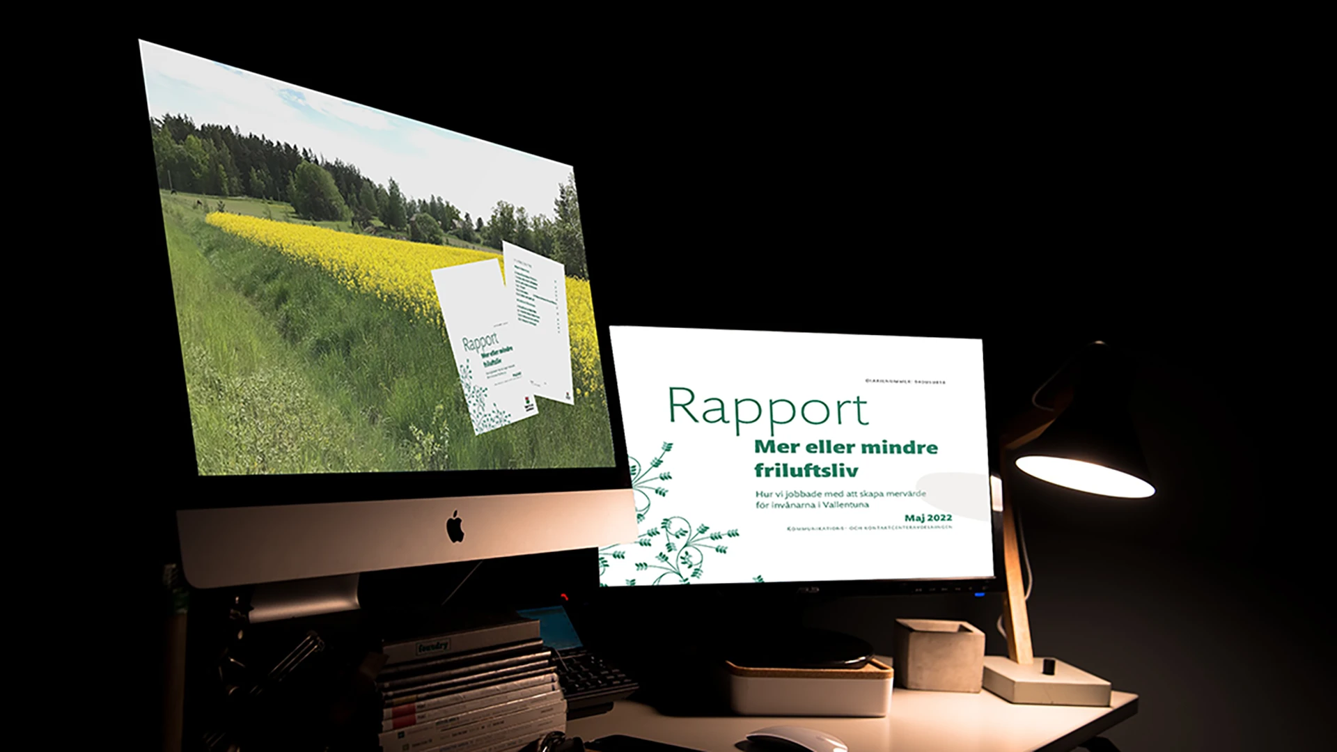
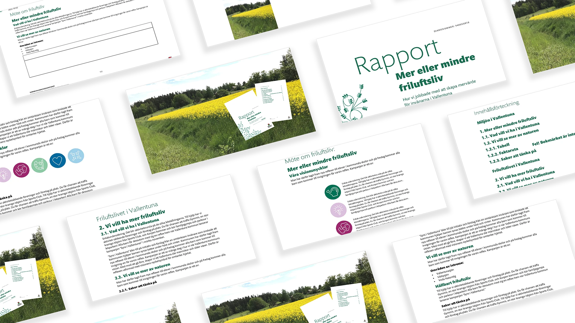
We created four Word templates where structure, heading hierarchies and text placeholders made the documents easy to navigate. Alternative texts and accessible tables ensured that the content could be used by everyone. Our work combined accessibility with the visual identity of the municipality, while the special fonts were carefully checked both before and after implementation.

The result was four quality-assured Word templates that both strengthen Vallentuna municipality's visual expression and make it easy to create accessible documents. The municipality can now be confident that every report, letter or document is professionally designed, easy to absorb and in line with both profile and legal requirements.