Branding work where complete graphic profile, graphic design, printed matter, film, template and presentations were included in the scope. Next Period's need for functional and flexible visual identity set the framework for the project, which also became the basis for websites and brands within the business.
Automate your reportsLearn more about our Office templates
Public and Non-profit sector
25
Next Period works with gender equality issues based on menstruation. With different focus areas in the business, they needed a graphic profile and a logo that was flexible enough to work in many contexts - without losing strength in the brand. They also needed templates, videos and ready-made presentations to work on the material themselves.
The brief was to create a visual identity that matched the company's vision: to stand out and feel urgent, but also be inclusive and hopeful. The identity also had to be flexible enough to be used in everything from apps and event videos to printed materials and presentations.
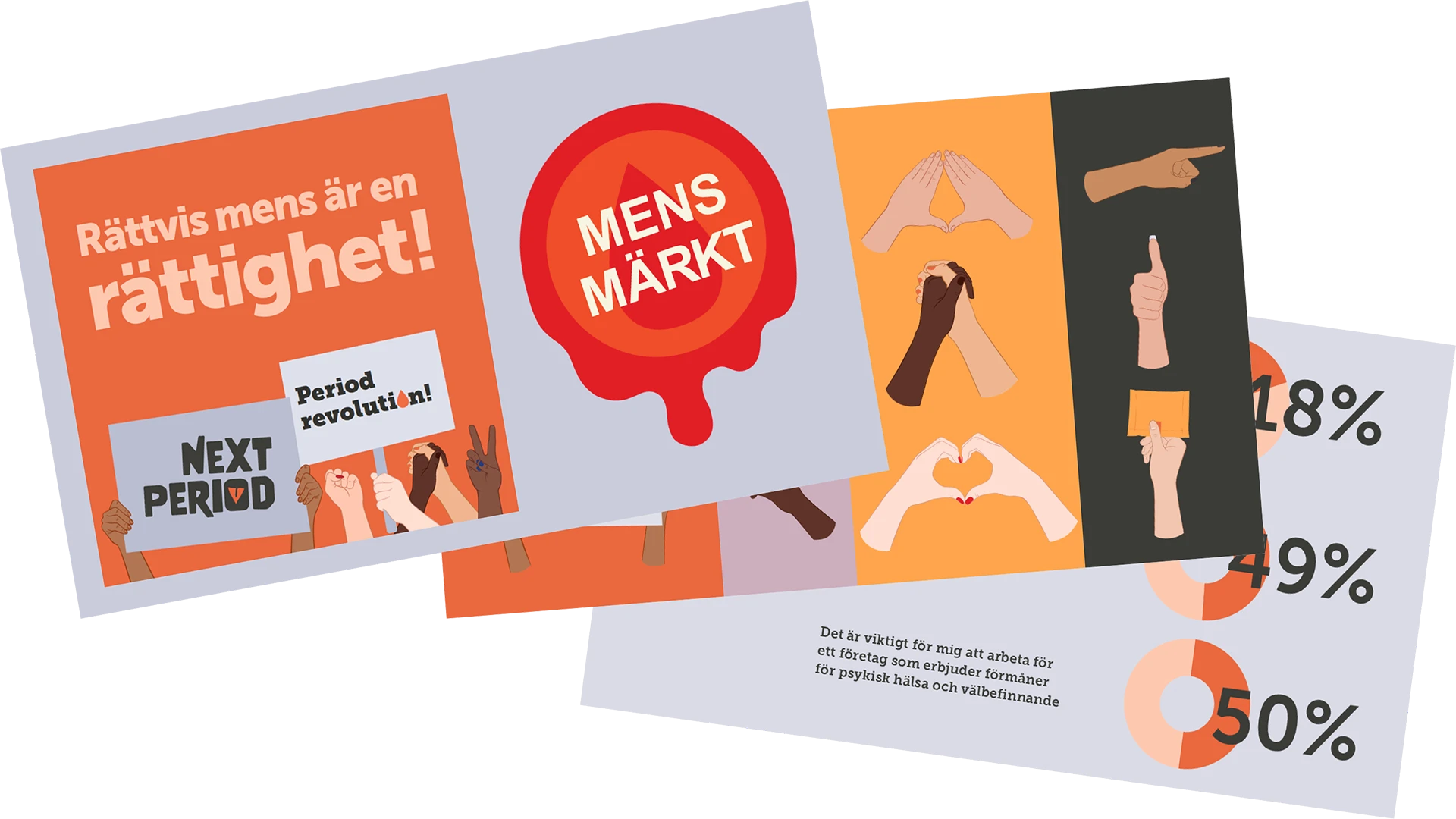
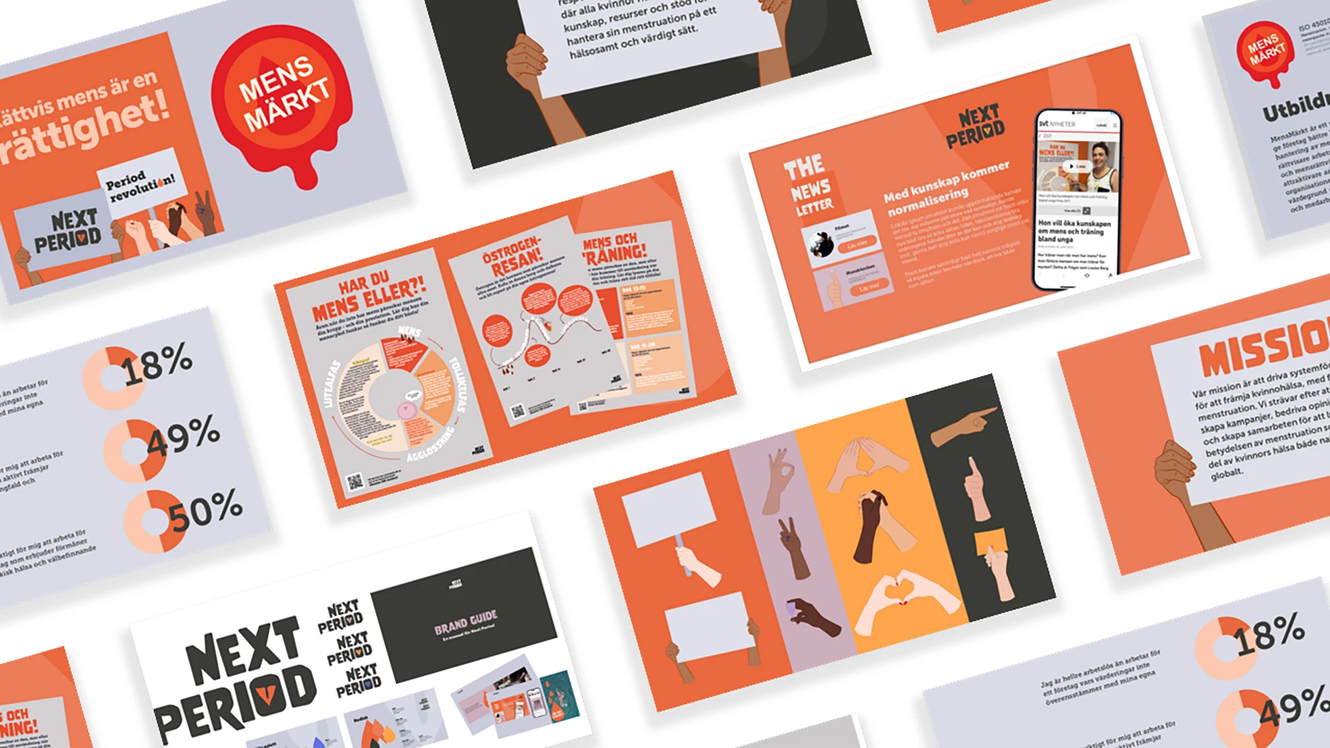
We developed a complete graphic profile with logo, colors, typography and graphic elements. The work also included film material for events and collaborations, visual material for an app, seals and printed matter such as posters. To make the work usable in the long term, we created templates and a corporate presentation where the graphic elements were used as practical message enhancers. Animations and films were integrated to make the presentation both vivid and branded.

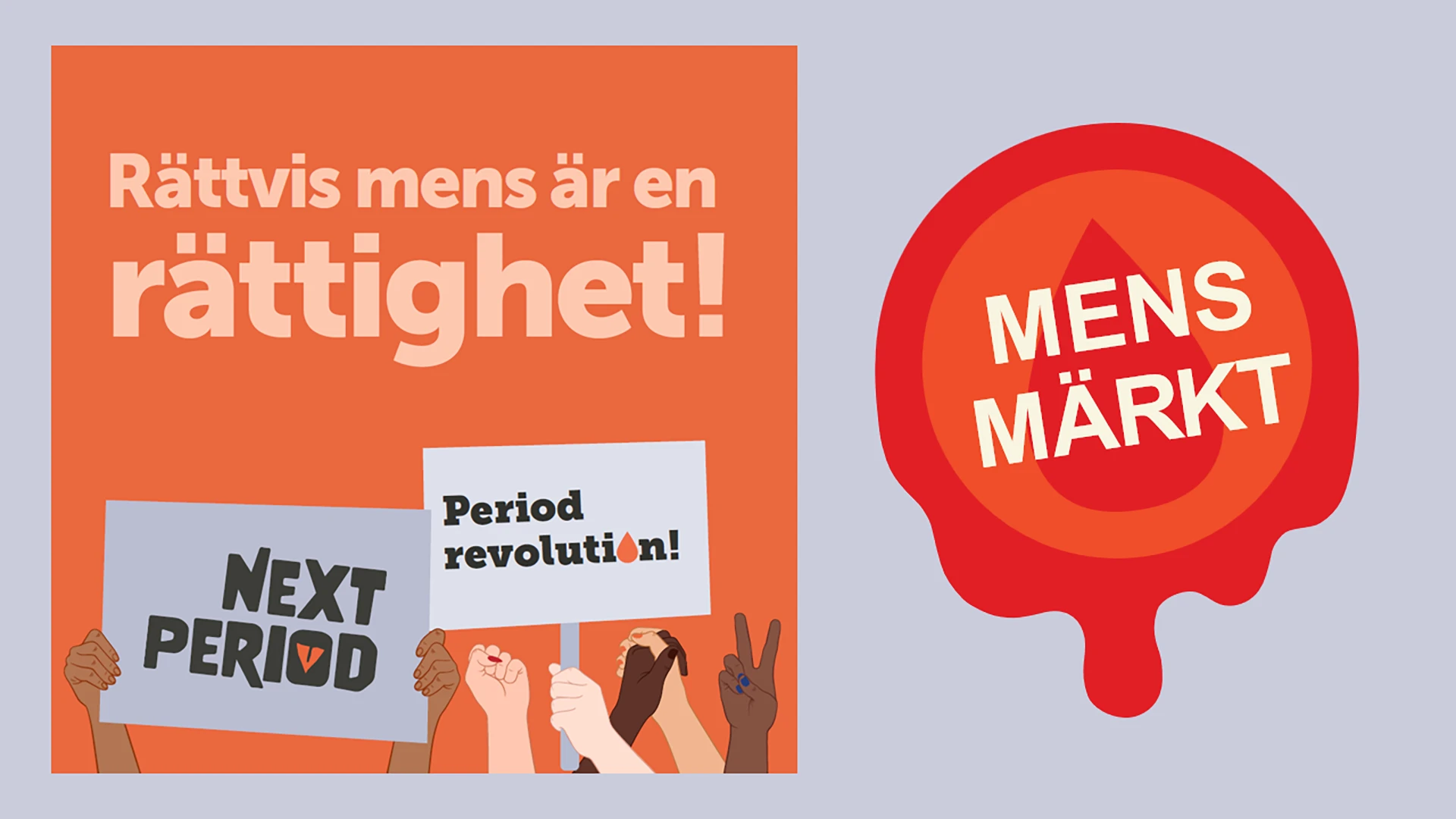
The result is a visual identity that is both strong and flexible - ready to be used in many different contexts. The corporate presentation works as a stand-alone product and a visual support in dialogues, while the templates, videos and graphic material make it easy for Next Period to continue to develop their brand in line with the business. The identity strengthens both their presence and their key messages.
Branding work where complete graphic profile, graphic design, printed matter, film, template and presentations were included in the scope. Next Period's need for functional and flexible visual identity set the framework for the project, which also became the basis for websites and brands within the business.


The brief was to create a visual identity that matched the company's vision: to stand out and feel urgent, but also be inclusive and hopeful. The identity also had to be flexible enough to be used in everything from apps and event videos to printed materials and presentations.
We developed a complete graphic profile with logo, colors, typography and graphic elements. The work also included film material for events and collaborations, visual material for an app, seals and printed matter such as posters. To make the work usable in the long term, we created templates and a corporate presentation where the graphic elements were used as practical message enhancers. Animations and films were integrated to make the presentation both vivid and branded.
The result is a visual identity that is both strong and flexible - ready to be used in many different contexts. The corporate presentation works as a stand-alone product and a visual support in dialogues, while the templates, videos and graphic material make it easy for Next Period to continue to develop their brand in line with the business. The identity strengthens both their presence and their key messages.
Next Period works with gender equality issues with menstruation as a starting point. Their business has different focus areas and needed a logo and a graphic profile that could be applied in different contexts without losing strength in the brand. They also needed templates, films and ready-made presentations, so that they could then work with the material that was produced.
We developed a visual identity that matched the company's vision of standing out, having a sense of urgency in its design language, but at the same time feeling inclusive and hopeful. We also produced film material to use at events, as explainers and in various collaborations with other actors. the work also included developing visual material for an app, seal and printed material such as posters.
The corporate presentation that was developed became a product that can work as a stand-alone and as a good visual complement to talks and draws. By using graphic elements in the profile as practical message enhancers, the presentation was also clearly linked to the brand. The presentation includes animations as well as a movie.